
Creativity Challenge: A Painting in Two Colors

Learn how an extremely limited palette is all that’s needed to explore value and temperature—and take on the world.
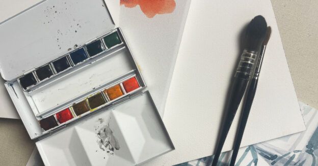
When you’re feeling restless, do you ever daydream about walking out the door with just a pack on your back, free to go wherever your boots take you? My personal fantasy has me wandering off to sketch my way around the world, from my home in Vermont all the way to Timbuktu, and back again. I wouldn’t take much with me … maybe just a compass, a bedroll, a change or two of clothes, and art supplies: a small pad of paper, a brush and a little watercolor palette filled with burnt sienna and ultramarine blue.
That’s it, just a brown and a blue.
This may seem like an overly limited palette for a round-the-world trip, but I’d be in good company carrying just those two tubes of paint. Before the Industrial Revolution provided the wide variety of pigments we use today, landscape painters made do with just a few colors that came from the earth, like raw umber, yellow ochre and burnt sienna. When artists added blue to their palette, they had all they needed to paint what they saw from the sky on down to the ground.
Brown + Blue = Limitless Results
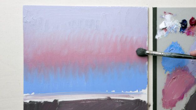
There’s a surprising amount you can do with just brown and blue. Right out of the tube, pigments like burnt sienna and ultramarine blue are potent and intense. Mix them together to make mysterious, deep darks. Thin them with water or white paint, and they transform into delicate pastel tints. Or, brush pure brown and blue side by side for clean, bright contrasts of warm and cool.
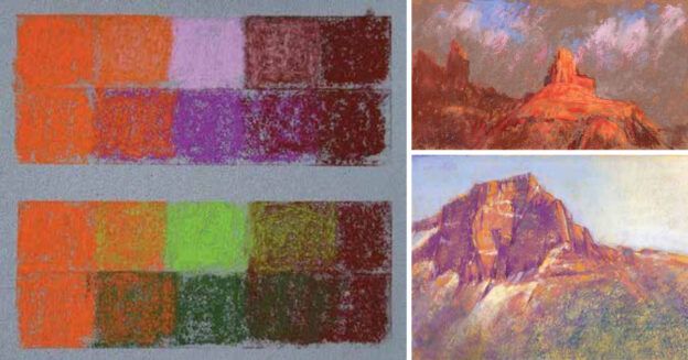
You may be wondering what warm and cool have to do with the pigments on our palette—and how temperature differences play a big role in painting. Think of it this way: Colors that lean toward yellow (including brown) are warm, and those that lean toward blue are cool. Experimenting with just one warm and one cool pigment can lead us back to basics, but also toward new directions in our work, with exciting possibilities for stronger compositions.
For example, temperature contrast helps expand the sense of space in our landscape painting. A cool blue brushstroke retreats into the distance, while a warm reddish-brown pulls forward. The power play of warm and cool to create movement holds true with still lifes, figures, abstracts and any other subject matter. Temperature differences cause shapes to push and pull, energizing the composition.
The exercise of limiting your palette to just a blue and a brown also allows you to focus on composing with dark and light values without the distraction of color. We love color; it can make our hearts soar. But color can also be a powerful distraction as we try to determine a painting’s design. There’s much to be learned by limiting ourselves to just a stripped-down two-color palette so that we only focus on value and temperature, which are the building blocks of composition. The three creative challenges that you’ll find on the following pages will help you to explore the possibilities.
As in other aspects of life, there’s a lot to be said for simplicity in our approach to painting. It’s good to know that if we feel overwhelmed by a palette filled with pigments and a studio full of art supplies, we can throw just two tubes of color—a brown and a blue—in our pack, and have all we need to set out and paint the world.

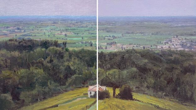
John Constable, J.M.W. Turner, John Sell Cotman and other artists from the Golden Age of British watercolor painted beautiful, expressive landscapes using a very limited palette. Above, Turner employs both a rich blue that spans from light to dark and glowing, delicate earth tones. The warm and cool contrast creates a composition with both deeply realistic space and lively abstract movement.
Challenge 1: Grid It Out

The power of warm brown and cool blue holds true even in abstraction, where temperature differences can create a strong push and pull that energizes the composition. Try painting a grid with just ultramarine blue and burnt sienna. See how much contrast in temperature and value you can get from square to square with just these two colors (plus white, if you’re using oils or acrylics).
Challenge 2: Push the Contrast
Select a photo reference with strong light and shadow and desaturate it in your phone or computer’s photo editor so that it’s black and white. Then recreate the image on paper or canvas using a brown paint and a blue paint. Employ a full range of lights and darks, pushing the temperature contrast of the colors by using them both pure and mixed.
In Café in Sun (watercolor on paper, 16×12), which depicts an outdoor dining scene in Provence, France, I used Prussian blue and quinacridone sienna. The reddish-brown sienna is my favorite for a limited landscape palette. My quick watercolor study, Vermont Cottage (watercolor on paper, 12×16) features ultramarine blue and burnt sienna.
The warmth of the brown alternating with the coolness of the blue in these compositions helps to create a dramatic sense of light and shadow, as well as a lively back-and-forth rhythm in the paintings’ shapes.


Challenge 3: Copy That
Copy a favorite masterwork using just a brown and a blue paint. Think of this as a loose sketch instead of an exact duplication. Simplify and even exaggerate the value design and any temperature changes you see. Here, I’ve interpreted Edward Hopper’s oil painting, Sailing, into a warm and cool watercolor study featuring a two-color palette of ultramarine blue and quinacridone sienna.


Meet the Artist
Susan B. Abbott earned an MFA from the Maryland Institute, College of Art, and exhibits her paintings widely in galleries and museums. To see more of her work plus her class schedule, visit susanabbott.com. Follow her on Instagram @susanabbott_art.
Enjoying this article? Sign up for our newsletter!
From Our Shop


Join the Conversation!