
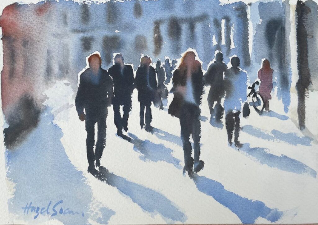
Figuratively Speaking

Putting people in a scene can be tricky. These pointers will help you make your figures simple, but credible.
By Hazel Soan
Including people in your paintings can add to the narrative and provide an injection of life that turns an ordinary piece into something special. Painting people, however, comes with some challenges. The moment you include figures in a painting, they become the first thing the viewer notices. If the figures are credible, they add life; if not, they can’t be ignored (and may even irritate). The following considerations will help you populate your paintings with less angst and more confidence.
Placement
Since figures—regardless of size—tend to become the subject, they need to own their space. They should look like they belong in the painting rather than as an add-on or afterthought. Take care to position your figures in a compositionally sound arrangement. Make them lively and plausible, not static
and wooden.

Speed, not Haste
People move, so to paint figures from life, you must apply paint to paper quickly. Concentration is essential. A blob can define a head, and a fragmented brushstroke may suggest a leg. Watercolor is made for speedy application, and since paint can be applied directly with the brush in a fast-and-fresh manner, there’s no need to draw first—especially when the figures are small and lack detail. In fact, direct watercolor sketches are often more lively when they’re not guided by a pencil.
The Right Brush
You’ll usually start with the head, so choose a brush that enables you to make an oval mark by simply pressing the tip onto the paper. I’ve found that a No. 6, 8 or 10 round or reservoir brush suits this task perfectly. Alter the pressure on the brush to broaden or narrow the stroke. For example, press down lightly for the head, and a little harder for the torso. Then lift the brush up so the tip just touches the paper to create thin, linear marks for arms and legs, pressing down slightly at the joints to suggest elbows and knees.

Confident Brushwork
The brush is a versatile instrument and makes attractive marks on the paper, so let it work for you. Allow it to dance on the paper as you paint. Hold the handle at its thickest part above the ferrule, so it can twist and twirl freely between your fingertips. Trust the brush to make lively marks and resist the temptation to correct your brushstrokes for the sake of accuracy.
Drybrushing
Dry brushstrokes leave attractive, ragged edges, ideal for suggesting movement in limbs and clothing. A rough paper will enhance this effect. Dry brushstrokes aren’t actually done with dry paint—they just require much less water than needed for laying a wash. If you find it difficult to assess the right mix for delivering a dry brushstroke, load the brush in the palette and then absorb excess water from the heel of the brush with a paper towel. (Be careful not to remove paint from the tip and body.) As you lay the drier paint, hold the brush at a lower angle, so that the paint will be delivered from the side and heel of the brush rather than just the tip.
Blending Wet-Into-Wet
By adding color wet-into-wet, movement is implied in the figure, which adds liveliness. Try to lay paint in a timely fashion so that the wet paint on the limbs merges with the added wet color for clothing. The paint will bleed into the wet color, creating a pleasing ambiguity. Allow shirts and pants to bleed into each other at the waist, and sleeves to merge with arms and hands. Shadows beneath hems will be suggested by default, as legs merge with skirts and shorts.

Pose and Proportion
All that’s needed to suggest a figure in a painting is an oval blob above a rectangle that divides into two or narrows to a V shape. It’s simple to suggest people because we’re so familiar with the shapes. Keep heads small and oval rather than round, shoulders broad, arms active or linked to the torso, and legs apart or merged in a V shape. One foot shown higher than the other suggests a walking motion. From a side view, a triangular space opens up between the legs when the pace is extended, and beneath the knees as the legs cross. From the front or back, feet are an extension of the leg and need only be indicated in the side view.
Highlights
As people move, the folds and creases of clothing catch the light, creating zigzag patterns of light and shade. In watercolor, the white of the paper represents the light, so highlights are represented by untouched white paper. The effect of bright light falling on the figure is created by leaving slivers and lozenges of untouched white paper within the clothing color or on the topside of upward-facing limbs. The light represented should be consistent, with highlights showing only on those sides that face the light. Light from overhead appears on hats, folded limbs, arches of feet and the calves of bent legs. Make use of the background color to bring out highlights and contrasts in tone.

Less Is More
Even though it might seem daunting at first, painting figures into a scene is a lot of fun. You’ll soon realize how little is required to establish their presence—and how much they can enliven a watercolor. Figures in a setting don’t need to be too detailed. The mere suggestion of people invites the viewer to engage with the composition. Just one or two credible figures can carry a whole crowd—the rest can be a bunch of blobby implications.
DEMO: Practicing People
Now it’s time to turn theory into practice. Go to a mall, park, beach or sporting event and get busy sketching. Choose figures in the middle distance who are standing or moving toward or away from you rather than across your line of vision. This will provide more time for you to grasp the pose. Begin by working in monochrome, then move into full color.
Artist’s Toolkit
Watercolor paper; Watercolor paints in your palette of choice; No. 6 or No. 8 mop or reservoir brush
Stage 1


Allow the brush to dance on the paper, loosely suggesting the pose with the head and limbs. Leave out the torso. When clothing is dark, you can paint the whole pose with the skin color. Be ready to add clothing color immediately (see stage 2). Create your figures with lively brushstrokes, taking note of the light and shade. For highlighted hats and shoulders, make a pencil mark to remind yourself where to bring in the background.
Stage 2


Add the clothing color, joining the limbs to the torso in the figures with lighter clothing than their respective skin color. Encourage the added color to merge wet-into-wet. If the whole figure pose has been painted in the skin tone, an opaque color––like the cadmium red used for the girl’s dress above––will overcome the flesh tint to brighten the hue. Adding a touch of background color will bring out the highlights on hats and shoulders.
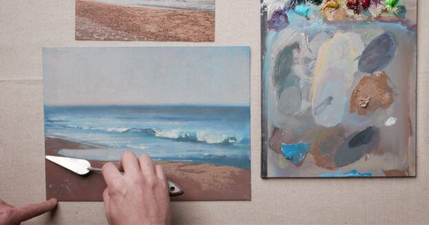
Stage 3


Now you’re ready to place people within a setting. Plan a simple composition; I chose a beach scene. Paint the figures first and, if needed, use light pencil marks to remind yourself where highlights will show up bright against the background. Bring the background coloring in around the figures. Contrast the values by painting lighter tones on the shaded side of the figures and darker tones against the lit side.
Final Stage

To complete Battling the Breeze (watercolor on paper, 7×11), I added more description into the rocks, ensuring that the dark values in the rock crevices weren’t as deep as the blacks in the figures. I also tinted the highlights on the rocks to make them less bright than the highlights on the figures, ensuring they come forward in the composition.
Meet the Artist
Hazel Soan (allsoanup.com) is a British artist who works out of studios based in London and Cape Town. She also enjoys traveling to paint on location in countries all over the world.
Enjoying this article? Sign up for our monthly exclusive events.
From Our Shop


Join the Conversation!